The U.S. Department of Health and Human Services and the U.S. Department of Agriculture released the most recent dietary guidelines this week. The basic gist is that based on the most recent food and nutrition research, the government publishes guidelines for the American diet to improve the health of the American public. It is a grand effort.
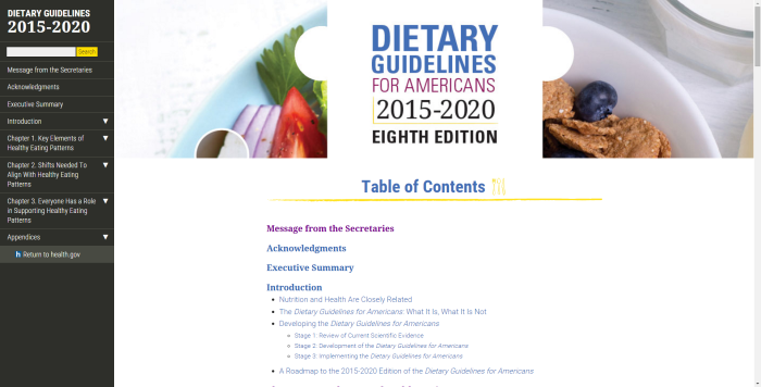
Of note, is the website design. I am thoroughly impressed with the attractive, simple, and useful presentation of the chapters of the report. As a printed document, I would never read this report. As a digitized document, I have read more than I probably ever would. So what is it that I think makes this website so great?
Menu
The menu on this website is a simple table of contents. Each listed section is an active link. It isn’t anything grand or something that required great programming effort; It is simple and easy to use. This is a good example of usable menu design.

Chapter Numbers and Simplicity
This report is also very easy to navigate because there are only three chapters, each with a clear label. From a user perspective, this makes the guidelines seem palpable. Oh, and the executive summary is so simple and visually apparent that there really is no need for the general American public to read the full report.
Information Categories
The categories chosen for each chapter effectively divide information between key information, needs for implementation, and the support needed for success. This website is so well designed, that it fits many different audience needs, if even by these simple categorizations.
Summary of Information
The executive summary is wonderful and perhaps the most important part of the website. In addition to teaching through simple visual cues, it also provides the correct balance of information. There isn’t so much detail in the executive summary that the reader is overwhelmed while at the same time there is enough information for the summary to serve its purpose of giving a brief and thorough overview of the full guidelines report.
